|
1. I used layers of wash and wet on wet to make the eggs appear round. I used splatter to add the spots on the eggs.
2. It was important for me to use transparent layers because the dark spots had to pop 3. My composition was successful because it is on the verge of being abstract but you can still tell that they are bird eggs. My composition is almost spiral because you look at each egg around the edge of the paper 4. Color choice was very important because we couldn't use black and in the painting, but the spots looked black in the picture. I had to make a dark color out of purple, brown, green, and blue. 5. I didn't worry about it looking realistic because it will always look like watercolor and i learned that from O'Keeffe. 6. I think I could've spent more time trying to bland the colors gradually but I still like the final look. 7. My work looks slightly unfinished and rushed. 8. I would've picked something more colorful to paint so that I would've worked harder on it. 9. I learned that it is very difficult to create a realistic look with watercolor. It discouraged me in the moment because I also stopped caring about my piece but i still enjoy using watercolor. Brainstorming List
Grass- bright yellow and green layered strands Bird egg- up close one behind the other- blue eggs Feather- close up in the stem Watermelon rind- stripes of yellow and green- hint of red showing Fall leaf- red or yellow with brown- see the veins Sprout in dirt- close up in the sprout mostly green with some brown Icey leaf- frozen leaf- green Rocks in stream- colored rocks w water flowing over Turtle shell- brown and yellow- part of body in it Cluttered shells in sand- some purple some blues Christmas tree- part of ornament showing Plant leaf with sun glare Colorful parrot feathers Inside kiwi with seeds Outside of melon- detail with the green lines running through the tan 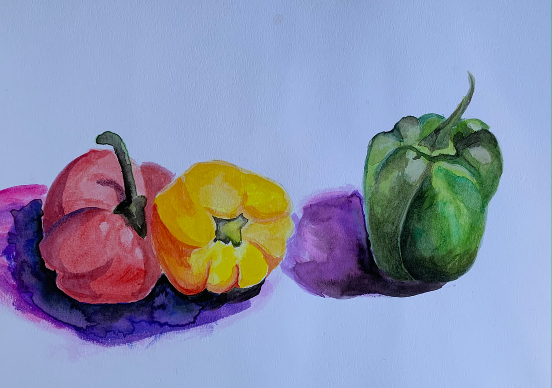 I copied the watercolor pictures of the peppers and used 3 techniques. I used layers of wash, blotting, and wet on wet.
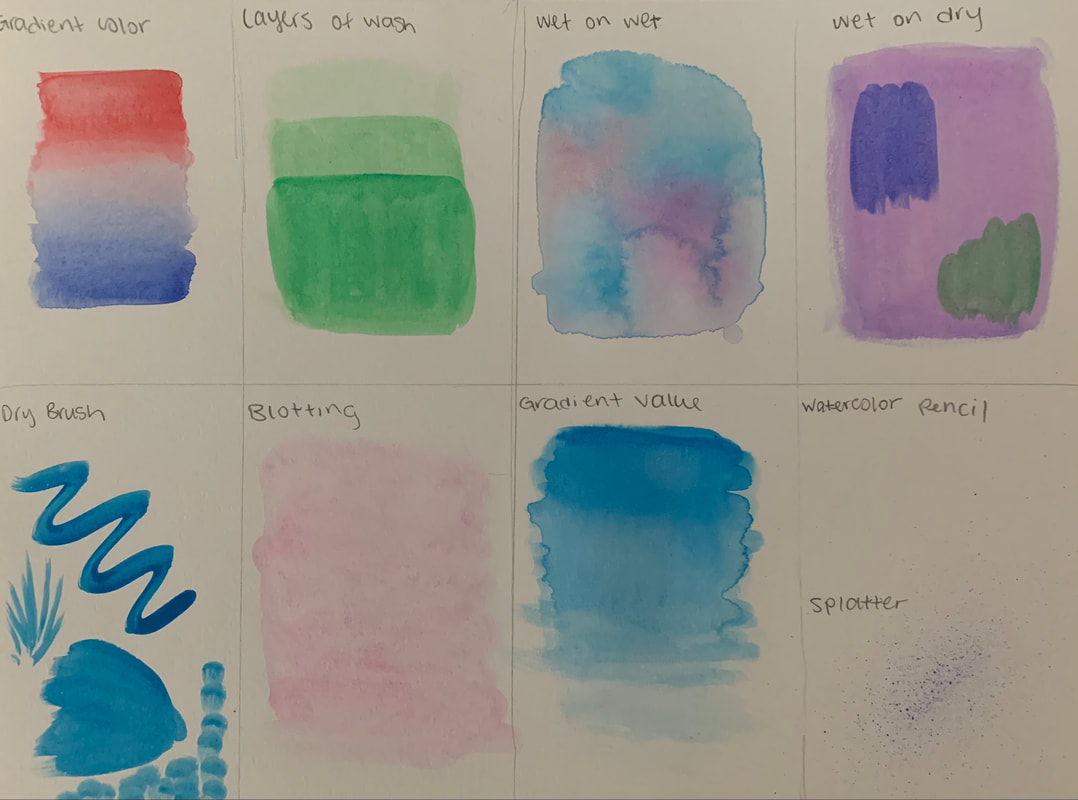 7 different techniques to use while working with watercolor. wet on wet and gradient value are my favorites.
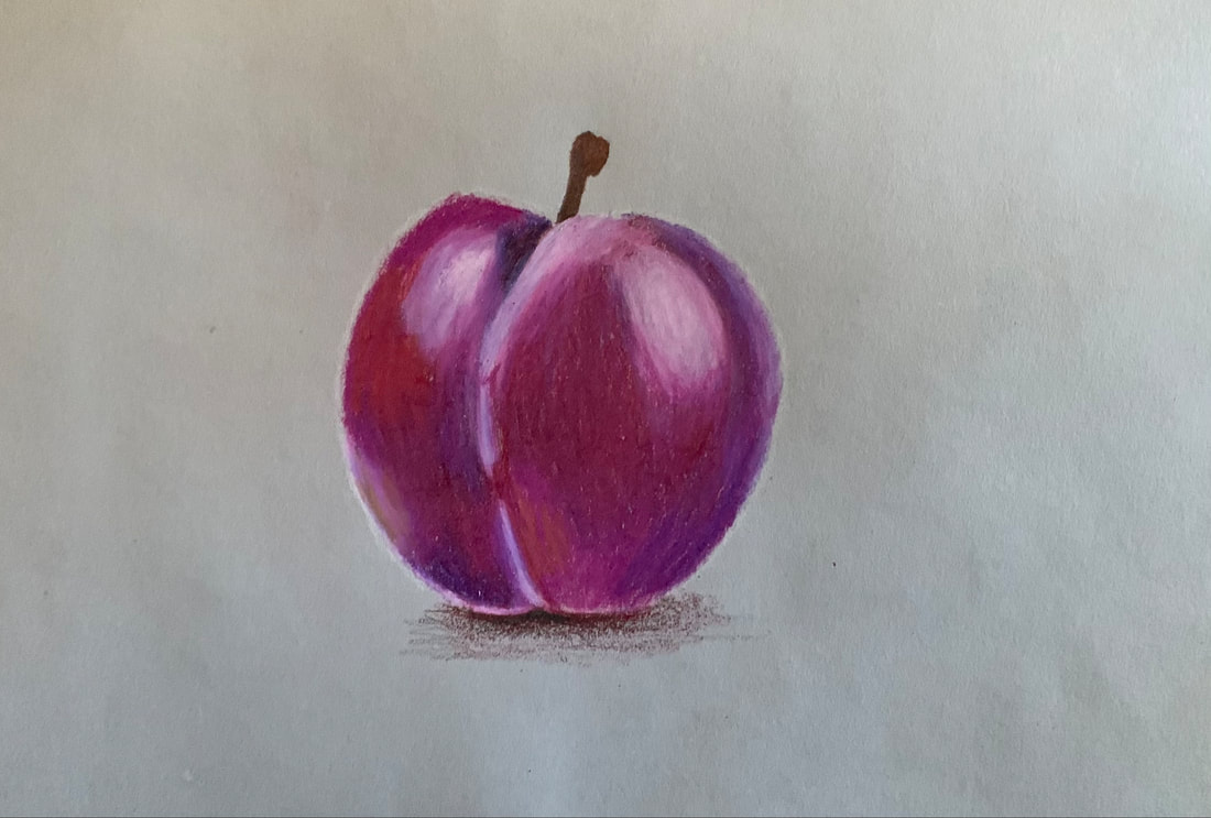 I chose to draw a plum with colored pencil. I thought it would take a long time, but it only took around 25 minutes and I was happy with it.
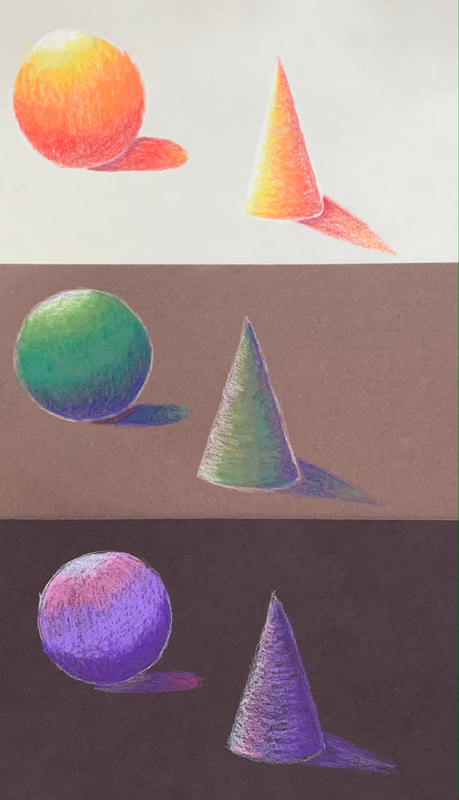 For this assignment I used 3 different colors on each color of paper. This helped my practice blending colors with this new medium.
1. The main pen techniques I used were stippling, hatching, and inventive. I used stippling for the path and the tortoise head because it shows more texture than the other techniques and i wanted the path to look like it had dirt on it. I used hatching for the hare to show the texture of its fur. I also used it on the trees to make the trees look round and to give them depth. I used inventive for the pattern of the trees and the pattern on the head of the tortoise because I wanted to use my own shapes to make it more realistic.
2. I used 1 point perspective to show that the tortoise and the hare were standing on a path surrounded by trees. Perspective is important in my piece because it brings out the true story of the fable where they race but it also adds more places to show value and my pen techniques. 3. Texture is most important in my piece for the skin and hair of the animals and for the trees. Trees have a very distinct texture that is hard to draw and the animals wouldn't be recognizable if the texture of the fur and scales wasn't shown. 4. Value is important in my piece to show the path getting farther away and the show the trees are getting smaller because they are farther away. 5. I think my piece was crafted very well but the leaves could be improved a lot with practice. 6. I would spend more time with the leaves because it was hard to make them look like they were draping over the top of the animals' heads. I would have practiced on a different sheet with ways of drawing leaves with pen. 7. I chose tortoise and the hare and i showed this by drawing the realistic animals at the start of a path like the are about to begin their race. 8. It is important to understand the techniques for your final piece to look professional. For example if I didn't know to make the stippling darker in the spots with shadows, there would be no value in my piece. 9. This unit helped a lot with understanding how to add value and shadows which is a very important skill for any artist to have. 20 brainstorming ideas:
1. Tortoise and hare- tortoise head on fat person/ hare head on runner body - outside in forest maybe - 2 pt? 2. Aladdin- carpet in sky 3. Maleficent- when her wings were taken 4. Pocahontas- she is drawn as her real age 5. Goldie locks but the bear comes into her house and the dad hangs the bears head on the wall 6. Mother goose/ mother Teresa 7. Pinocchio on a lie detector test -1 pt 8. Pinocchio as real boy 9. Shrek- donkey and dragon- realistic- in front of castle 10. Snow White gets married to one of the dwarves 11. Maleficent and sleeping beauty in enchanted forest 12. Little mermaid but she didn’t take Eric to shore she drowned him 13. Rapunzel as a POC leaning out of tower 14. Snow White as a POC- laying in coffin 15. Sleeping beauty as a POC- in forest 16. Fairy god mother but she’s really old - standing in front of carriage 17. Lion and mouse- lion is saved- lion is farther away for perspective- 1 pt? 18. Lion and mouse - lion's paw on mouse 19. Medusa in cave maybe 1pt 20. Maleficent and aurora roles reversed |


 RSS Feed
